Culture
Seasonal
Ad Fatigue Cheat Sheet for the Holiday Season 2017
Nov 15, 2017
Seasonal
Nov 15, 2017
The holiday season is probably the most difficult time to stand out from the crowd and to keep your advertising campaigns fresh and exciting. Most advertisers are facing the challenge of ad fatigue. In this blog, we give you tips on how you can avoid your biggest nightmare.
Imagine you run a Pre-Christmas campaign for about one month starting this week. This is the time of the year when pretty much all advertisers go all out and advertise more than ever. This makes it even more difficult to stand out from the crowd. You realise that not only your cost-per-click is increasing but also your click-through rate is dropping. You feel like running in circles and screaming out loud.
Does this feeling sound similar to you? This is pretty much every advertiser’s nightmare, also known as ad fatigue. It’s the moment when your customers have seen your ads for so many times that they start getting annoyed at them.
How can you avoid this nightmare and prevent ad fatigue? In this blog, we give you 7 tips on how to avoid ad fatigue. In the end, this will help you run a successful advertising campaign on Facebook.
Have you ever thought about spicing up your ad placements and use desktop, mobile and Audience Network placements for your Ad Set?
By using many different ad placements, you can get a higher number of engagement for your ads.
There is no doubt that seeing the very same ad every day can get super annoying for your audience. But how about seeing a different ad from the very same company? With our Ad Fatigue Preventor, you can set your own rules to prevent audiences from seeing the same ad over and over again.
With the rules to switch ads every day, you’ll be able to minimise ad fatigue.
On top of that, we’ll automatically switch off poor performing ad creatives. This way we can find the best-performing ones out of the A/B test.
Changing your ad’s background colour can have a huge effect on people. In fact, people respond to different colour combinations in different ways. For example, the colour blue makes people feel calm and think clearly. Yellow makes people feel optimistic and happy. Green is the colour of refreshment and peace.
So, if someone is in a good mood, he or she might ignore your dark-coloured ads. But an unhappy person might get drawn to ads that use peaceful colours.
Once you have created new ad backgrounds, follow the previous tip and let your ads get automatically rotated.
According to Forbes, about 5,000 images get shared every second on Facebook. Not only can images increase the visibility of your ad by 94% but can also increase someone’s willingness to read the content by 80%.
Long story short: images are easier to process and make it simple to get vital information across. That’s why images are the most important aspect of your ad creative.
Do you want to increase your conversions as soon as possible? Then you must not forget your headline. Create a headline that is a big and bold and promises to solve your customer’s challenges. According to research, headlines have the power to deliver a 10% conversion lift.
Your successful headlines should have one of the following approaches:
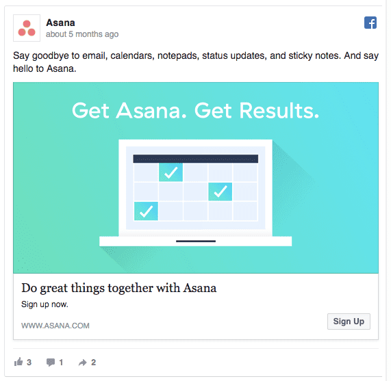
No matter what approach you take, keep your headlines short and sweet – like the one by Asana.

The supporting copy should include the benefits that add context to your offer, explaining how easy and effective it is. Don’t forget to keep your copy short. Facebook users don’t have time to read long texts but want to get informed quickly.
The average post text is only 14 words long, while the link description is around 18 words based on research of 37,000+ Facebook ads. Finally, the Call to Action should be clear and help your audience to get the value you are promising.
Want to know how you can edit your copy and metadata? Read our blog on Facebook’s recent solution.
For your ads to be successful, you need to A/B test them. Just because your ad is working today doesn’t mean it will work tomorrow.
Via our platform, you can A/B test your ads automatically. Yes, that’s right. You no longer have to do that manually.
Avoiding ad fatigue by creating compelling ad creatives can be challenging and a long way to go. There are so many variables that you need to keep in mind. A lot of time (and money) gets wasted when not knowing how to create the best ad creatives.
Start with your ideal placement, which is driven by your campaign’s objectives. From there, start thinking about a compelling value proposition.
Use images that communicate almost everything that needs to be said so it can stand on its own and doesn’t need a lot of supporting text.
Keep your headlines short and sweet. In the end, a successful ad creative isn’t just a bunch of isolated variables but needs to be strong on all pieces to create one successful ad.
And finally, our platform can help you avoid ad fatigue with our automatic ad fatigue preventor. Just sign up and try it out for free!